How to Measure Community Engagement That Matters

To really get a handle on your community's health and prove its worth, you have to look beyond the surface. It’s not just about how many members you have; it’s about what they’re actually doing. Are they talking to each other? Are they contributing ideas? That’s where the real magic happens. This kind of data-driven thinking is what shifts your community from a simple cost center to a core part of your business strategy.
Why You Need to Measure Community Engagement

Let's be honest. Building a community feels great, but if you can't show it's making a difference, it's just a feel-good project in the eyes of the business. Ditching vanity metrics like total member count isn't just a good idea—it's a necessity. When you have solid engagement data, your community stops being a budget line item and starts looking like a predictable engine for growth.
Justify Your Resources
When you need to ask for a bigger budget or another team member, "I have a good feeling about this" isn't going to fly. But what if you could show your boss that a 15% increase in active members directly led to a 10% drop in support tickets? That’s a conversation they’ll listen to. Hard numbers are the only language that really matters to leadership.
The whole point of measurement isn’t to make pretty dashboards. It's to truly understand your community's pulse, tie your efforts to real business outcomes, and confidently ask for what you need to grow.
Tracking engagement gives you the proof you need to protect your programs from budget cuts and make a rock-solid case for future investment.
Connect Your Work to Real Business Wins
Beyond just defending your budget, consistent measurement can uncover some seriously impressive business impacts. Did you know that brands with thriving online communities see a 53% higher customer retention rate than those without? On top of that, a whopping 76% of consumers admit they're more likely to buy from companies that have a strong community. If you want to dive deeper, you can check out the full breakdown in these community management statistics.
This isn't just about creating a friendly forum; it's about building a competitive advantage. You can start drawing direct lines between community activities and key business goals:
- Better Customer Loyalty: Show that your most active members also have the highest lifetime value.
- Lower Churn: Compare the retention rates of engaged community members against those who aren't involved.
- More Brand Advocacy: Track how often your members share content or refer new customers.
This kind of data flips the script. The conversation changes from "community is a nice-to-have" to "our community is essential for driving revenue and retention." It proves that every single Q&A, member spotlight, and discussion thread is a strategic move that contributes directly to the bottom line.
Choosing Community Metrics That Actually Matter
I've learned the hard way that trying to track everything is a fast track to understanding nothing. When you're figuring out how to measure community engagement, the real goal isn't to pile up data; it's to find those few key signals that tell you how your community is really doing. The first move is to stop chasing hollow numbers like total member count and start focusing on metrics that show genuine participation.
This shift in thinking is absolutely critical because every community is different. A B2B software community might be all about reducing support tickets by getting users to help each other. On the other hand, a fan club for a new sneaker brand is probably more focused on sparking brand love and getting people to share their own content. Whatever your goal is, your metrics have to match.
Moving Past Vanity Numbers
It’s so easy to get wowed by big numbers that look great in a presentation but tell you absolutely nothing. Think about it: a community with 10,000 members but only 50 active people is way less healthy than a tight-knit group of 500 where 300 are constantly chatting and contributing. The magic is in the interaction, not just the headcount.
This isn't just my opinion; it's where the industry is heading. Smart community managers are ditching the superficial stuff and digging into metrics that show real, authentic engagement.
Here’s what they’re prioritizing instead:
- Active Members: The unique users who actually post, comment, or react within a given period.
- Peer-to-Peer Interactions: How often are members answering each other's questions? This is gold for cutting down support costs.
- Member Contributions: The amount of user-generated content, feedback, or new ideas flowing from your community.
Tracking these deeper metrics gives you a much more honest picture of your community's pulse.
Below is a quick table to help you distinguish between the metrics that just look good and the ones that actually help you make decisions.
Vanity vs Actionable Engagement Metrics
This table contrasts superficial 'vanity' metrics with meaningful 'actionable' metrics, helping you focus on what truly indicates community health.
| Metric Category | Vanity Metric (What to Avoid) | Actionable Metric (What to Track) | Why It Matters |
|---|---|---|---|
| Membership | Total Members | Monthly Active Members (MAMs) | Total count is deceptive. Active members show who is actually engaged and getting value. |
| Content | Total Posts | Average Replies Per Thread | A high post count could just be noise. High replies indicate a real, thriving conversation. |
| Activity | Page Views / Likes | Session Length / Time Spent in Community | Clicks are easy and cheap. Time spent shows that members are deeply invested and finding value. |
| Contribution | Number of Ideas Submitted | Percentage of Ideas Implemented | A pile of ignored ideas is useless. Tracking implementation shows the community is influencing the product. |
Focusing on the "Actionable" column will give you a real story to tell about your community's impact, not just a list of flashy but meaningless numbers.
Aligning Metrics with Business Goals
The best metrics are the ones you can tie directly to a real business outcome. If your community exists to collect product feedback, then "monthly feedback submission count" is a non-negotiable KPI. If it's all about customer happiness, then "survey response rate" and "average satisfaction score" are your best friends. Even for specialized groups, it's crucial to how to measure social media ROI for churches, as this helps you pick the right metrics from the start.
This visual gives a great example of performance indicators for a community built around feedback and satisfaction.
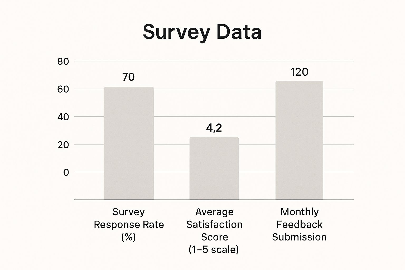
You can see right away that satisfaction is high, but there’s a clear opportunity to get more feedback submissions. Connecting these community data points to business objectives is also a must-have when you measure marketing ROI effectively. It's how you justify your budget and prove your community's strategic importance.
A great metric doesn't just measure activity; it measures progress toward a specific business goal. If a metric doesn't help you make a better decision, it's just noise.
When you get this right, you end up with a dashboard that provides clarity, not confusion. It gives you the power to tell a compelling story about your community's value, all backed by data that your stakeholders will understand and appreciate.
Finding the Right Tools for the Job

Okay, so you've figured out what success looks like for your community and which metrics matter. Now comes the fun part: finding the right gear to actually measure it all. Honestly, without the right tools, you're just guessing. You're making decisions based on hunches, not hard data.
Thankfully, we're in a great spot. The market for community platforms is blowing up. In fact, it's expected to reach around USD 4.3 billion by 2025, and it's not slowing down. This boom is fueled by a massive need for better digital connection and collaboration. You can dig into more of the numbers on this growing market for community platforms.
What does that mean for you? Options. Lots of them. Let's look at how to sort through the noise.
Native Analytics vs. Dedicated Platforms
Most places where communities gather online—think Slack, Discord, or even Facebook Groups—have their own built-in analytics. These are a fantastic place to start. They’re free and give you a quick, decent overview of active members, which channels are buzzing, and when people are most chatty.
But you'll probably outgrow them. As your community gets bigger and more complex, those basic dashboards won't cut it. You’ll find yourself wanting to track more nuanced actions, slice and dice your member data in new ways, or connect community activity to your sales CRM. That's the moment a dedicated community platform goes from a "nice-to-have" to a "must-have."
A dedicated platform turns data collection from a manual, soul-crushing chore into an automated, background process. This lets you spend your time analyzing the insights, not just trying to wrangle the raw numbers.
These specialized tools give you much deeper, more flexible analytics. They can show you the entire member journey, pinpoint your most valuable contributors, and even automate tedious tasks. For instance, using a Domino toolkit, you could create reward-based quests and have the system automatically confirm off-platform actions like a tweet or a blog comment. That gives you super-clean data on how specific campaigns are performing.
Key Features to Look for in a Tool
When you start window shopping for a community tool, it’s easy to get wowed by all the bells and whistles. To avoid getting sidetracked, keep your focus on what will genuinely help you measure and improve engagement.
Here’s my shortlist of non-negotiables:
- Deep Analytics: The tool has to do more than just count people. I'm talking about member segmentation, sentiment analysis, and the power to track custom events that actually tie back to your business goals.
- Seamless Integrations: Your community isn't an island. A solid tool should plug right into the other software you use, like your CRM or email marketing platform, giving you a complete picture of each member.
- Scalability: Pick something that can grow with you. The platform that's perfect for your first 500 members should still be a powerhouse when you hit 50,000. It shouldn't get clunky or ridiculously expensive as you scale.
- Automation Capabilities: The best tools give you time back. Look for features that can automate member onboarding flows, handle reward distribution, or generate reports for you. This is a lifesaver for small teams. It’s particularly useful if you want something like a daily check-in app to keep simple, important interactions automated and consistent.
Ultimately, the "right" tool really depends on your specific situation. You might start lean with native analytics and patch together a few specialized tools. Or you might go all-in on a comprehensive platform from the get-go. Either way, the objective is the same: arm yourself with a toolkit that provides clear, actionable insights into the true health of your community.
Turning Raw Data Into a Compelling Story
Anyone can pull numbers from a dashboard. The real magic, though, is learning how to weave those numbers into a story that makes people lean in and listen. When you're figuring out how to measure community engagement, you have to blend the hard data with the human element to show what's really going on.
It means looking beyond the surface. A sudden jump in new posts? Great. But what are people actually talking about? Is the vibe helpful and positive, or is it slowly becoming a complaint fest? This is where you connect the dots between the quantitative (the what) and the qualitative (the why). That’s the difference between a data dump and a real strategic analysis.
From Numbers to Narratives
Let's be real: your execs don't have time to get lost in a spreadsheet. Your job is to be the storyteller. So instead of just dropping a stat like, "we saw a 20% decrease in support tickets," you need to build a narrative around it.
You could frame it like this: "That 20% drop in support tickets happened right after we launched the new member-led 'troubleshooting' channel. We're seeing our most active members step up to help others, which is not only fostering a great culture but also directly saving the support team's time." See the difference? Now it's a strategic win, not just a number.
A report filled with numbers is just noise. A report that tells a story—showing cause and effect—is what drives decisions and secures your budget.
This approach helps leadership understand that your community work isn't just a series of random activities. It shows them you're running a calculated strategy with tangible results.
Building Reports People Actually Read
If you want your reports to be read and not just filed away, think simple and visual. No one wants to read a wall of text or a dense grid of numbers. Your goal is to create something clean and scannable that highlights the big takeaways instantly.
I’m a big fan of a simple, one-page dashboard that tracks your key performance indicators (KPIs) over time. It’s the easiest way for anyone to spot trends at a glance—the good, the bad, and the interesting.
When you're putting your report together, try including these elements:
- KPI Scorecards: A quick, top-level summary of your main metrics. Think Monthly Active Members, Reply Rate, and how they stack up against the last period.
- Trend Graphs: Simple line or bar charts are your best friend here. They're perfect for showing growth over several months.
- Qualitative Highlights: This is where you add the human touch. Pull a few amazing member quotes, a glowing testimonial, or a screenshot of a particularly helpful interaction.
- Key Wins and Action Items: End with a bang. Briefly summarize what went well and, most importantly, outline what you plan to do next based on what the data told you.
This kind of structure makes your report easy to digest and keeps the focus where it should be: on insights and action. It shows you respect your stakeholders' time while proving the community's impact. Just look at a company like Oleeo; they showed a massive $245,000 ROI in their first year with a community by tracking things like reduced support tickets and traffic from new visitors. That’s the kind of story that gets people to sit up and pay attention.
Putting Your Insights to Work

Okay, let's be real. Measuring stuff without actually doing anything with the numbers is just a hobby. You’ve put in the work to pick your metrics, get your tools set up, and crunch the data. Now comes the fun part: closing the loop and turning all that information into real, tangible growth.
Your insights are a roadmap. They tell you exactly what your community is craving, what they’re ignoring, and where the hidden opportunities are. The trick is to stop reporting on what happened last month and start building a better experience for next month.
Think of your data as a conversation. If your analysis points to a consistent drop in activity every Wednesday afternoon, that’s your community sending you a signal. Your next move isn't just to make a note of it. It's to ask, "Okay, how can we fix this?" and run a smart little experiment.
Designing Smart Community Experiments
An experiment doesn't have to be some massive, all-hands-on-deck project. The best ones are small, focused, and easy to track. You just need to start with a clear hypothesis that comes directly from what you’ve observed in the data.
For instance, if your mid-week engagement is in a slump, your hypothesis could be something like: "Hosting a live Q&A with an expert on Wednesdays will increase mid-day engagement by 25%." See how that works? It’s specific, it’s measurable, and it’s a direct response to the problem you found. You're not just throwing spaghetti at the wall to see what sticks; you're making a calculated move.
Here are a few other ways data can spark an idea for an experiment:
- Low Peer-to-Peer Replies: Are members posting questions that go unanswered? You could test a "Top Contributor of the Month" program to see if a little recognition gets people helping each other out.
- A Hot Topic Pops Up: If you see one discussion thread blowing up with replies, that's a clear signal of interest. Spin it off into its own dedicated webinar or a member-led workshop.
- New Members Go Quiet: Seeing new users disappear after their first week? You could experiment with an automated onboarding quest in a tool like Domino that guides them through a few key actions to get them hooked.
The goal isn't to get every single experiment right. It's to learn something useful from every attempt, whether it succeeds or fails. This is how you build a community that people actually want to be a part of.
From Small Test to Full-Blown Strategy
After you run your experiment, the measurement cycle starts all over again. Did that weekly Q&A actually move the needle on Wednesday engagement? If it did, fantastic! You might have just found a new cornerstone for your content calendar.
If it didn't work? That’s also a win, because it’s a valuable piece of information. Maybe the timing was off, or the topic wasn't quite right. Now you can tweak your approach and try again.
This constant loop of Measure > Analyze > Experiment > Repeat is the engine that drives a healthy, growing community. It ensures your strategy is always based on what your members are actually doing, not just what you think they want. Each test, big or small, refines your approach and makes your engagement efforts more effective over time.
This experimental mindset is a key part of how the best communities are built. If you want more ideas on what to test, you can check out some of these proven https://domino.run/blog/community-engagement-best-practices. By constantly testing and learning, you shift from just reacting to problems to proactively building a better community.
Got Questions? We've Got Answers
Let's dive into some of the questions I hear all the time about measuring community engagement. No fluff, just straight-up advice you can put to work.
How Often Should I Be Looking at My Metrics?
This is all about finding the right rhythm for you and for your leadership team. They're usually not the same.
For your own sanity and to keep a finger on the pulse, a quick weekly check-in is your best bet. Think of it as your Monday morning coffee routine—a quick scan to see what's trending, spot any red flags before they blow up, and jump on new conversations. It keeps you agile.
But when you're talking to stakeholders or the C-suite, don't overwhelm them with the daily ups and downs. A monthly or even quarterly report is much more powerful. It tells a bigger story, connecting your community's activity to real business goals without getting lost in the weeds. The key is consistency; pick a cadence and own it.
We're a Brand New Community. Where Do We Even Start?
If you can only track one thing, make it your Active Member Rate. Forget vanity metrics like total member count for a minute. This one is pure gold.
This number tells you what percentage of your members are actually doing something—posting, commenting, liking—over a set period, like 7 or 30 days. It’s the truest sign of a healthy, breathing community. A high active member rate means you’re creating something people actually want to be a part of, not just a list of names.
Focusing on active members forces you to create value and experiences that bring people back. It's the difference between building a room full of people and hosting a great party.
How Do I Actually Prove the ROI of Our Community?
Ah, the million-dollar question. Measuring community ROI is all about connecting the dots between engagement and business outcomes. It’s how you show that the community isn't just a "nice-to-have" but a genuine revenue-driver and cost-saver.
It can feel a bit daunting, but you can start with a few concrete things:
- Support Deflection: How many support tickets are being solved by other members? Every time a community member answers a question that would have otherwise gone to your support team, that’s a direct cost saving. Start tracking it!
- Lead Generation: Are you getting new customers from the community? Use special links or ask "How did you hear about us?" on your sign-up forms. Tagging leads that come from the community is a simple way to attribute real revenue.
- Customer Retention: This one is huge. Look at the churn rate for members who are active in your community versus those who aren't. I'd bet my lunch money that the community members stick around longer. That difference in retention has a massive financial impact.
Ready to stop guessing and start growing? With a tool like Domino, you can build out reward-based campaigns that not only boost these metrics but also give you the clean data to prove your impact. You can get a campaign live in minutes.