Build a High-Converting Nocode Landing Page

Tired of waiting around for developers? A nocode landing page is the secret weapon every Web3 marketer needs. It lets you take a campaign from a spark of an idea to a live, polished page in just a few hours—not weeks. This kind of speed means you can start capturing leads while your competitors are still stuck in planning meetings.
Why Nocode Is a Game-Changer for Web3 Marketing
In the breakneck world of Web3, speed and flexibility are your most valuable assets. Let’s be real, the old way of doing things is a massive bottleneck. You know the drill: endless back-and-forth between marketing, design, and engineering teams. A simple copy change or a new hero image? That could take days to get live, and by then, the opportunity might be gone.
This is where a nocode landing page completely flips the script.
By ditching the code, tools like Domino put the power directly into marketers' hands. You can build, test, and tweak your campaigns all on your own. This isn't just about convenience; it's about being able to run multiple A/B tests on a whim, pivot your messaging in an instant, and react to what the market is telling you right now.
From Concept to Launch in Record Time
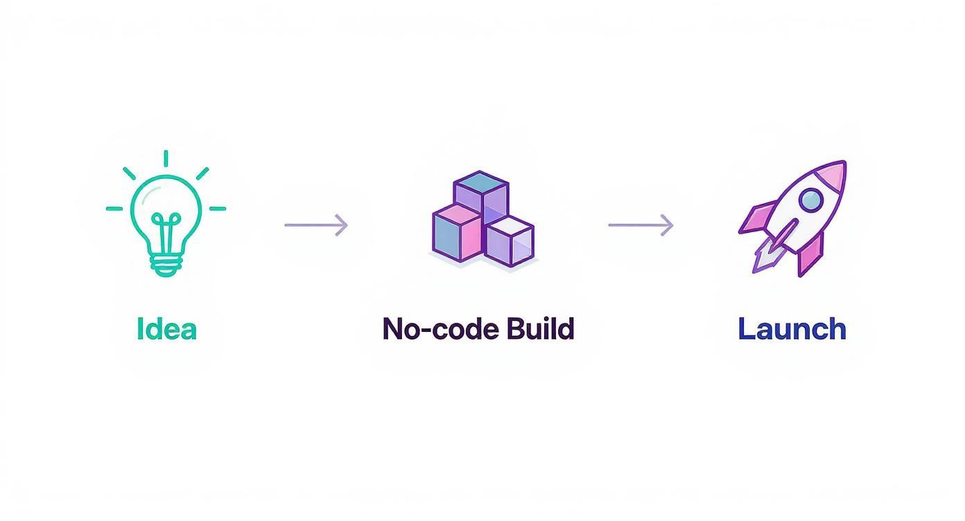
The entire workflow becomes ridiculously simple. Instead of a tangled web of dependencies and technical hurdles, you have a straight shot from idea to execution.
This graphic really nails the three-step flow: you start with an idea, jump into a quick nocode build, and then launch it into the wild.
This isn't just a small tweak to your process; it’s a massive leap in efficiency that gives you a serious competitive edge. In fact, studies show that no-code builders can slash landing page creation time by as much as 90%. Think about that. Marketers with zero technical background can deploy perfectly optimized pages in a fraction of the time it used to take.
Let's look at how the old and new ways stack up.
Traditional vs Nocode Landing Page Workflow
This table breaks down the time and resources you save when you move from old-school development to a modern nocode approach.
| Stage | Traditional Web Dev | Nocode with Domino |
|---|---|---|
| Brief & Scoping | 1-2 weeks. Multiple meetings with dev and design teams. | 1-2 days. Marketing team outlines goals and copy. |
| Design Mockups | 1-3 weeks. Static designs, feedback rounds, revisions. | Same day. Design happens directly in the builder. |
| Development | 2-4 weeks. Front-end and back-end coding, QA cycles. | 2-4 hours. Drag-and-drop build, no coding required. |
| Revisions | Days per change. Requires a developer for every update. | Minutes. Marketers make changes instantly. |
| Total Time | 4-9 weeks | 1-3 days |
The difference is staggering. You’re not just saving time; you're reclaiming your agility and ability to react.
Take Full Control of Your Campaigns
Nocode platforms give you an intuitive, drag-and-drop interface. Honestly, building a beautiful page feels more like putting together a presentation in Canva than it does coding a website.
The visual editor means what you see is what you get. No more guessing games or awkward handoffs to a developer, hoping they get the spacing right. You have complete control over every element, ensuring everything is perfectly on-brand.
The real power of nocode isn't just building faster; it's about owning the entire campaign lifecycle. When you can make instant updates, you're always optimized and never waiting.
This level of control, especially when you can easily integrate other tools, is what truly sets you up for success. For example, connecting your nocode page to a powerful backend for automation is a breeze. To really get the most from this setup, you should check out our guide on marketing automation best practices to create a seamless journey for your users, from their first click all the way to conversion.
Designing a Landing Page That Captures Attention
Alright, enough theory. Let's get our hands dirty and actually build something.
Creating a visually compelling nocode landing page inside Domino isn't just about making things look pretty. It's about making smart, strategic design choices that speak directly to a savvy Web3 audience. The real goal is to engineer a page that naturally guides people straight to your call-to-action.
First things first: start with a clean, modern template. Domino gives you plenty of solid options built for clarity and impact, which is a lifesaver when you're staring at a blank screen. Find one that matches your brand's vibe, whether that's minimalist and techy or bold and energetic. This gives you a great foundation so you can focus on the important stuff—your message.
Once you've got your template, it's time to make it yours. This is where your brand's personality shines through. The drag-and-drop editor makes it super simple to pop in your logo and apply your color scheme. Just a heads-up: don't go crazy here. Consistency is your friend. A few well-placed brand elements are all it takes to build trust and look professional.
Structuring Your Content for Maximum Impact
How you lay out your information is just as crucial as what you're saying. Your most important content has to live "above the fold"—that's the stuff people see without having to scroll. Think of it as your digital billboard. You've got about three seconds to hook someone.
Your core value proposition needs to be front and center, impossible to ignore. Use this prime real estate for:
- A Killer Headline: Say exactly what you do and who it's for. No fluff.
- A Concise Subheading: Add a quick sentence for context or to highlight a key benefit.
- A Compelling Visual: An image, a cool animation, or a short video showing your project in action works wonders.
- A Primary Call-to-Action (CTA): Your main button, like "Join the Whitelist" or "Get Started."
Nailing this section means every visitor instantly gets what you're about. It sets the stage perfectly, encouraging them to scroll down and learn more. For a great look at how to build an engaging experience from scratch, check out our guide on how to build a Web3 treasure hunt.
Using Visuals to Drive Engagement
Let's be honest, a wall of text is a conversion killer. You have to break up your copy with visuals that can explain complex ideas in a heartbeat. And don't just think static images.
Embedding a short demo video, for example, can be a game-changer. In fact, using video strategically can boost conversions by as much as 86%. It's a powerful way to show how no-code tools can deliver serious results, not just save you time.
A great design doesn’t just look good—it communicates. Every color, font choice, and image should serve a purpose, guiding the user's eye and reinforcing your core message.
Ultimately, your nocode landing page should feel intuitive. Use plenty of white space to let your content breathe and establish a clear visual hierarchy. Bold headlines, distinct sections, and buttons that pop will create a smooth journey from the moment someone lands on your page to the moment they convert. And you can do it all without writing a single line of code.
Writing Copy That Actually Converts Your Web3 Audience
A slick design will get people to stop scrolling, but it's your words that will convince them to stick around and take action. When you're putting together a nocode landing page for a Web3 audience, your copy has to be just as intentional as your visuals. This crowd is smart; they can smell generic marketing fluff a mile away and will tune it out in a heartbeat.
The trick is to be clear and direct. Your headline needs to nail two questions right off the bat: "What is this?" and "Why should I care?" Ditch the clever-but-vague phrases. Get straight to the point with a benefit-driven statement that hits on a real user problem or desire. For example, instead of "The Future of Decentralized Finance," try something more concrete like, "Earn Passive Yield on Your Crypto, Securely." See the difference?
Speak Their Language
Your copy has to vibe with the core values of Web3—we're talking transparency, ownership, and community. Use words that reflect that ethos. Instead of calling people "users," try "community members" or "participants." It's a small change, but it makes your project feel like a collaborative effort, not just another corporate product.
Being precise with your terms is also a big deal. If you're talking about a new protocol or token, explain what it does without drowning your audience in jargon. For those who want to go deeper, you can always link out to more detailed articles, like our guide on what a crypto token is. This keeps your landing page clean and focused on the main goal.
Write for Scanners, Not Readers
Let's be real: people don't read websites anymore, they scan them. Your job is to make your most important messages jump off the page during that quick scroll.
- Short paragraphs are your friend. Stick to one to three sentences. This creates breathing room and makes your content feel way less intimidating.
- Use bullet points. They're perfect for breaking down features, benefits, or next steps. They catch the eye and make information easy to digest.
- Bold key phrases. Use bold text to highlight the most critical parts of a sentence, a standout statistic, or an important term.
This approach lets visitors grab the essentials in seconds, which makes them far more likely to slow down and actually engage with your content.
The best copy doesn’t try to sound smart; it makes the reader feel smart. It should be so clear that it feels effortless to understand, empowering them to make a decision.
Nail Your Call to Action (CTA)
Alright, this is crucial. Every single element on your page should funnel visitors toward one, powerful Call to Action. This is where a lot of landing pages fall flat—they present too many options, which just creates confusion and paralysis. Decide on the one thing you want people to do. Is it "Join Our Discord"? "Mint Now"? "Sign Up for the Waitlist"? Pick one and commit.
Your CTA button should be impossible to miss. Use a contrasting color and punchy, action-oriented text. The data doesn't lie: landing pages with a single, clear CTA convert way better. In fact, some studies show they can hit conversion rates as high as 13.5%. For more stats like this, you can discover more insights about landing page performance. By cutting the clutter and focusing on a single goal, you remove friction and create a clear path for your community to follow.
Don't Forget Mobile: Speed and Performance Matter
So, you’ve built a killer landing page on your desktop. It looks incredible. But have you checked it on your phone yet?
Seriously. In Web3, thinking your audience is glued to a desktop is a rookie mistake. The vast majority of your community—the people who will actually mint your NFT or join your Discord—will find you while scrolling through Twitter on their phones.
This isn't just a "nice-to-have." A mobile-first mindset is non-negotiable if you want to capture attention and actually get people to click that "Connect Wallet" button. The great thing is, modern builders like Domino do a lot of the heavy lifting for you, making your page responsive straight out of the gate. But a few manual tweaks can take your mobile experience from "okay" to "awesome."
Put yourself in their shoes. Can you easily read the text without pinching and zooming? Are the buttons big enough for a thumb to tap without accidentally hitting something else? These little things add up to a much better experience.
Dialing in the Mobile View
Even with a solid responsive template, you absolutely need to pop open the mobile preview in your editor. What looks perfect and spacious on your big monitor can quickly become a jumbled mess on a small screen.
Here are a few quick fixes I always make:
- Crush those images. Huge, unoptimized images are the number one killer of page speed. I use a free online tool to compress my images before I even think about uploading them. You want the smallest file size you can get away with without it looking pixelated.
- Check your fonts. Text that looks fine on a desktop can be way too small on a phone. I usually bump up the body text to at least 16px for mobile. It makes a world of difference for readability.
- Give your buttons room to breathe. Make sure your main call-to-action button is front and center. It shouldn't be squeezed between other elements, forcing users to perform finger gymnastics to tap it.
- Shorten your forms. Nobody wants to fill out a long form on their phone. If you have more than a couple of fields, ask yourself if you really need all of them. Less friction means more sign-ups.
Making these changes in a drag-and-drop editor takes minutes, but it's one of the highest-leverage things you can do. If you're looking for a quick way to diagnose and address these issues, some guides show you how to fix your landing page using AI in under an hour.
Just look at the data. It's common to see a ton of mobile traffic but much lower conversion rates compared to desktop.
This gap isn’t a problem; it’s a massive opportunity. By focusing on mobile speed and usability, you can close that conversion gap and turn more of that phone traffic into actual community members.
A mobile user's patience is razor-thin. If your page takes more than three seconds to load, you've probably already lost over half of your visitors. They're gone.
The trend isn't slowing down. By 2025, mobile traffic is expected to account for a staggering 83% of all landing page visits. That single statistic should be enough to convince you to prioritize mobile. When you nail the experience for users on the go, your nocode landing page will be in a prime position to convert, no matter where your audience finds you.
Tracking Your Performance and Improving Results
Getting your no-code landing page live is just the starting line. The real work—and the real fun—begins when you start digging into the data to see what’s actually resonating with your audience. This is how you turn a simple page into a finely tuned marketing machine that consistently delivers.
First things first, you need to hook up your Domino page to an analytics tool. This is your window into how people behave once they arrive. It’s easy to get lost in a sea of charts and numbers, so my advice is to ignore the noise and focus on just a few key metrics that tell you the real story.
Key Metrics That Actually Matter
Forget about vanity metrics like total page views. Instead, let's look at the numbers that truly reflect how well your page is doing its job. These are the stats that will point you toward smart, effective changes.
Conversion Rate: This is your north star. It’s the percentage of visitors who actually do the thing you want them to do, whether that’s joining a waitlist, connecting a wallet, or signing up for an airdrop. If this number is low, it’s a direct signal that your message or design isn’t quite right.
Bounce Rate: This metric shows you how many people hit your page and leave immediately without clicking anything. A high bounce rate is a red flag. It could mean your headline is weak, the page is taking too long to load, or your ad targeting is off.
User Flow: This is like a GPS map of your visitors' journey. Where do they click? Where do they drop off? Understanding their path helps you find and fix any confusing spots or roadblocks in the experience.
These aren't just dry statistics; they're feedback, pure and simple. Your audience is showing you exactly what's working and what's not.
Think of your analytics as a direct conversation with your community. They’re telling you what they like and what confuses them—all you have to do is listen to the data and respond.
Adopting a Test and Iterate Mindset
Once you have a handle on your baseline performance, it's time to start experimenting. This is where A/B testing becomes your secret weapon. The idea is simple: create two versions of your page (an 'A' version and a 'B' version) with just one small difference, then see which one gets better results.
Your nocode landing page builder makes this process a breeze. You can clone your page with a single click and tweak one element. Try testing a punchier headline, a different hero image, or a button that says "Get Early Access" instead of "Submit."
To really get an edge, you can incorporate some proven conversion rate optimization techniques into your tests. By continuously testing and measuring, you move away from guesswork and start making data-backed decisions that drive real improvement.
This cycle of launch, measure, and iterate is what separates the okay campaigns from the legendary ones. It’s also where the scalability of no-code really shines. It's fascinating—businesses that maintain 10-15 landing pages tend to see around 55% more customer acquisition than those with fewer than 10. Find out more about landing page performance statistics. This stat shows just how powerful it is to constantly be testing and launching new variations. You're not just throwing things at the wall; you're building a system for predictable growth.
Got Questions About No-Code Landing Pages?
Diving into no-code landing pages for your Web3 project is a game-changer, but it’s totally normal to have a few questions before you jump in. We hear these all the time, so let's tackle the big ones head-on and get you ready to build.
You might be thinking, "Is this for real? Can I actually build a professional-looking page without a developer?" The answer is a hard yes. These platforms are built from the ground up to be visual and intuitive. You're not writing code; you're dragging, dropping, and designing.
How Long Does It Really Take to Build One?
Honestly, if you already have your copy and visuals ready, you can have a killer landing page up and running in a few hours. The actual building part is the fastest. What usually takes the most time is figuring out what you want to say and finding the right images or logos.
With a tool like Domino, the build process itself is ridiculously quick. Using templates and a visual editor means you can slash the technical work by up to 90% compared to coding it all by hand. That frees you up to think about strategy instead of getting stuck on syntax.
Can I Connect My Page to Other Marketing Tools?
Absolutely. Modern no-code builders aren't meant to live on an island; they’re designed to plug right into the tools you already use. Connecting your page to your marketing stack is usually straightforward and doesn't require a developer.
Most of the time, it's as simple as grabbing an API key or pasting a little tracking code into the page settings. This lets you build a fully connected marketing funnel with tools like:
- Email marketing platforms (Mailchimp, ConvertKit)
- Analytics dashboards (Google Analytics)
- Your CRM for lead management
This connectivity is what turns your landing page from a simple brochure into a lead-generating machine that can track performance and automate your follow-ups.
Are No-Code Landing Pages Any Good for SEO?
They definitely can be, but you have to do your part. No-code platforms give you all the controls you need for solid on-page SEO, which is crucial for showing up in search results.
You get easy access to edit page titles, meta descriptions, image alt text, and heading structures (H1, H2, etc.). The key is to actually use these features. Do your keyword research and write high-quality content that speaks to your audience. The good news is that these builders are already optimized for mobile and speed, which are two things Google really cares about.
The biggest mistake is assuming the tool handles SEO automatically. A no-code landing page builder is like a car—it gives you the steering wheel and the gas pedal, but you still have to drive it with a good content strategy.
What's the Biggest Mistake I Can Make on My First Page?
Without a doubt, the most common pitfall is clutter. People get excited by all the features and end up throwing way too much on the page. Multiple calls-to-action, paragraphs of dense text, and distracting animations all work against you.
A great landing page has one job and one job only. Before you even open the editor, decide on that single goal. Is it to get someone on a whitelist? To download a whitepaper? Whatever it is, every single element—from the headline to the button—should push the visitor toward that one action. When you're not sure, just keep it simple. Simplicity converts.
Ready to launch your Web3 campaign without getting bogged down in code? With Domino, you can build a high-converting no-code landing page in minutes, not weeks. Get started for free and see how easy it is.